GEORG FRANZ
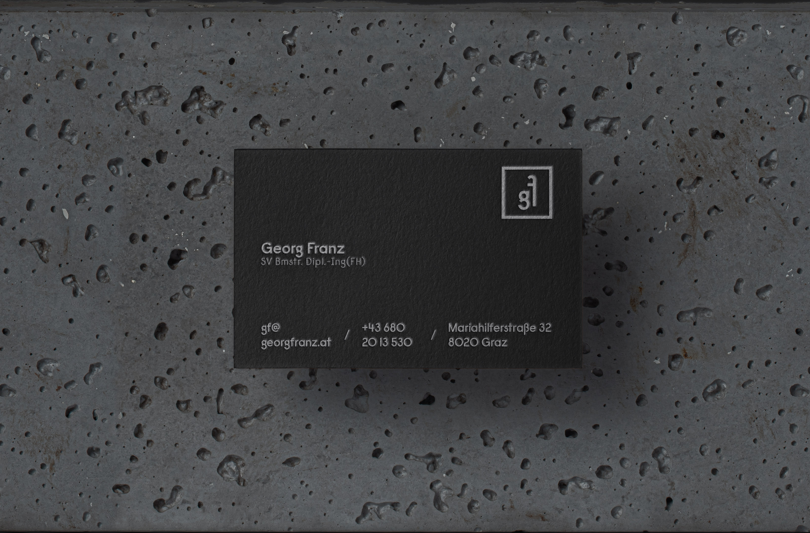
Brand identity for a real estate agent in Graz. Inspired by the minimalistic Bauhaus museum in Berlin. The Logo typeface was chosen to have some specific characteristics but also to be very minimalistic and classy to represent his field of work. Since he is colorblind it was very important to him that the design works well in black and white.
The posterseries presenting his agency also allows to be used for each property as marketing tool. A similar design is used for the properties brochures. The branding was kept very minimalistic but highly elegant to reassure the feeling of high quality. That's also why the business cards are a letterpress print on black paper.
The estate brochures, posters and company magazine work in a complementary design. Every estate has it's own particularity which is emphasized in the designs of the sales folder and poster. This gives each property additional value by showing off its personality.