HOW MUCH IS THE FISH?
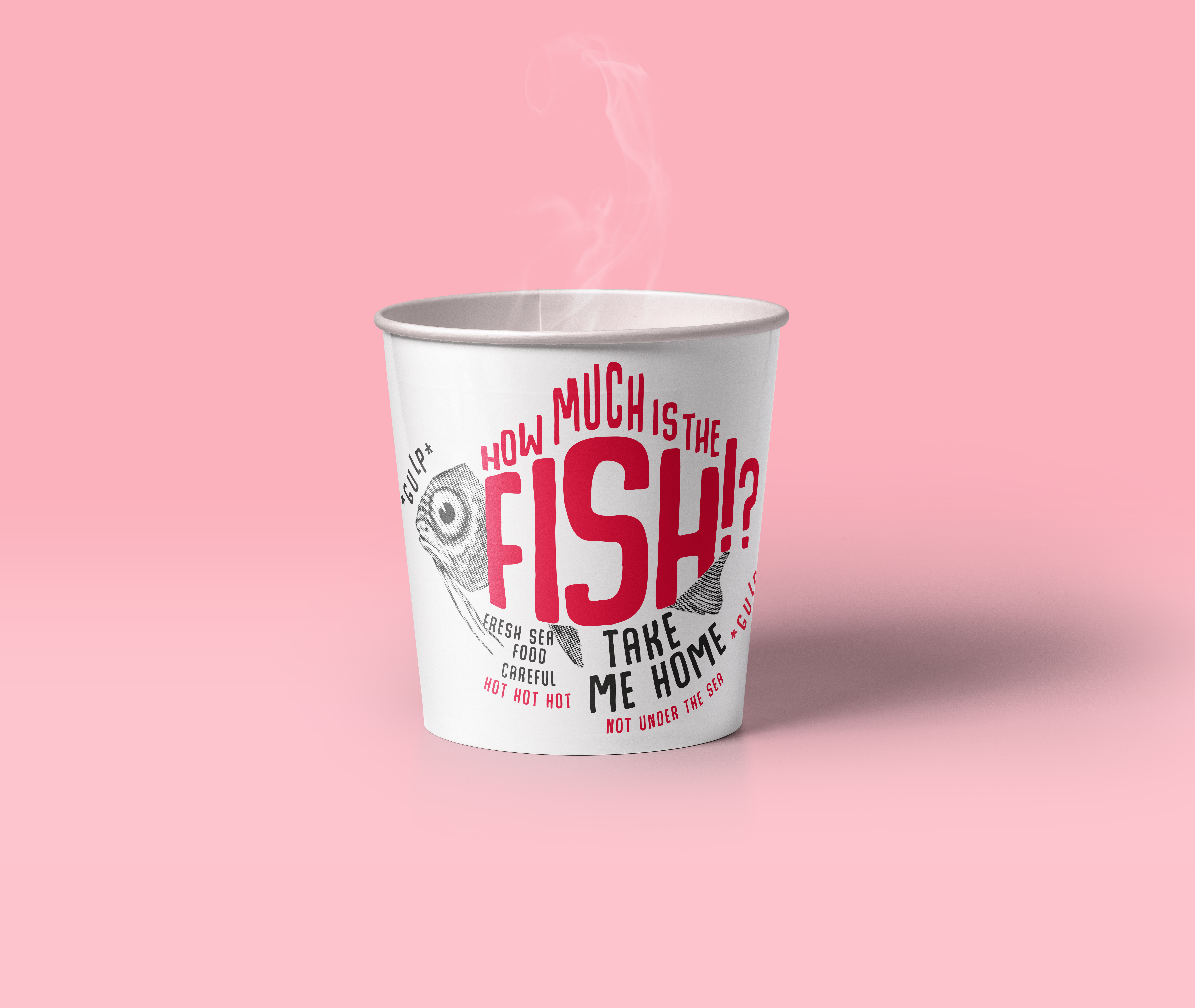
This is a playful branding identity for a fish pop-up restaurant or street food truck. The idea came to me while listening to scooter. I created a concept which is very playful and humorous. Its design combines a screenprint graphic and playful typography.
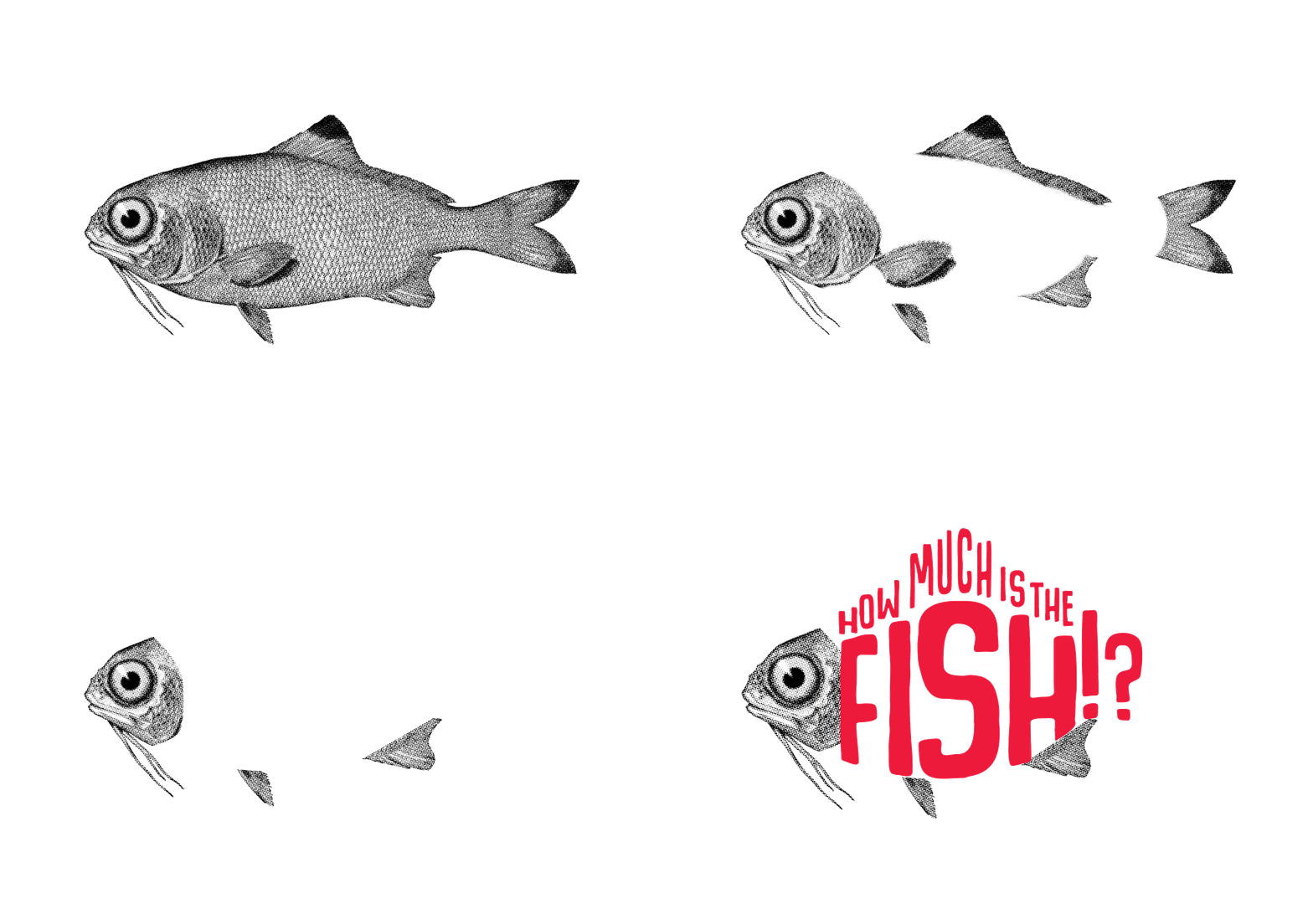
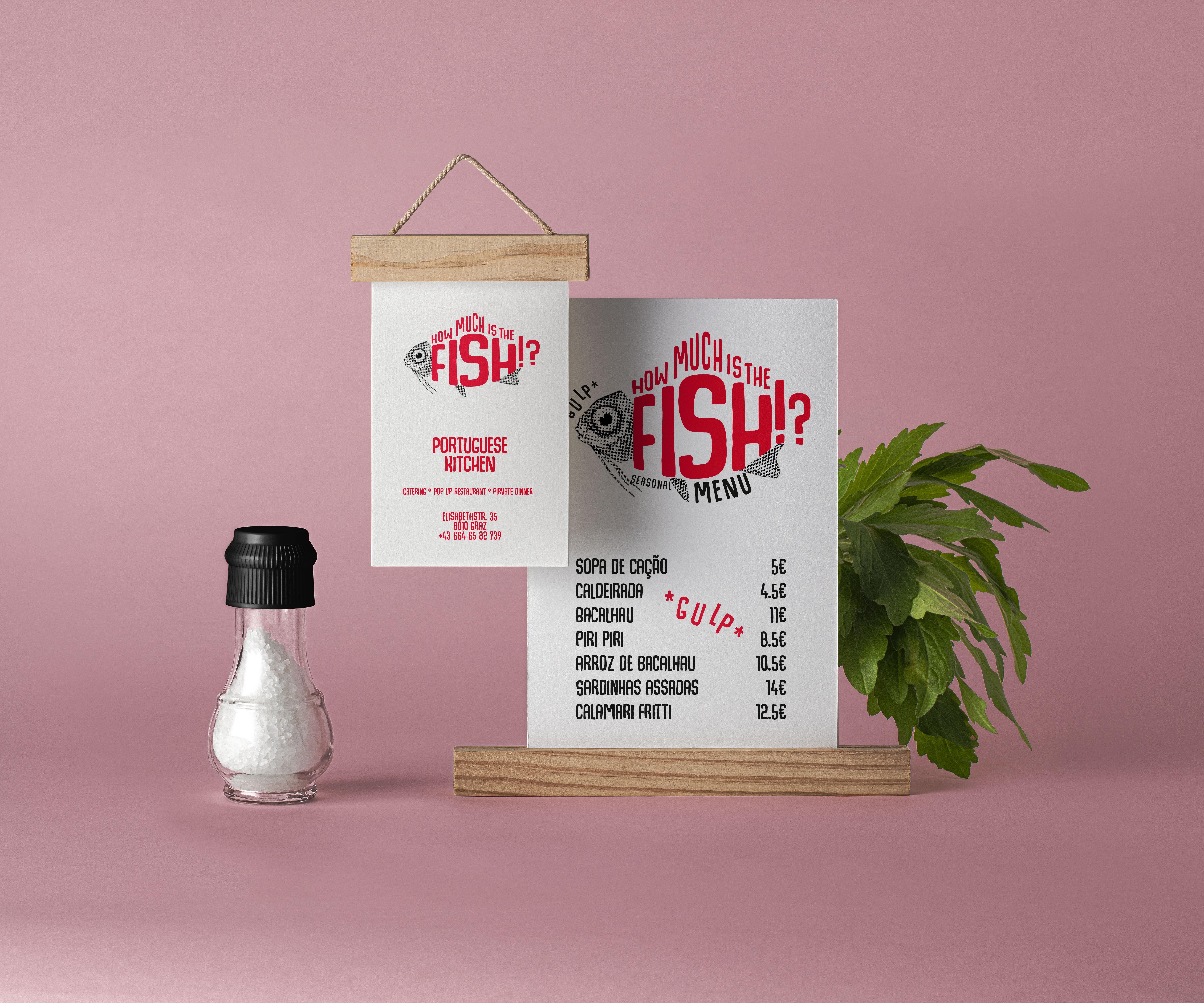
The fish is supposed to look a little "shocked", like he knows what's coming, that's why I also used the word *gulp* to underline it. In the brand concept, the sarcastic wording plays a crucial role.
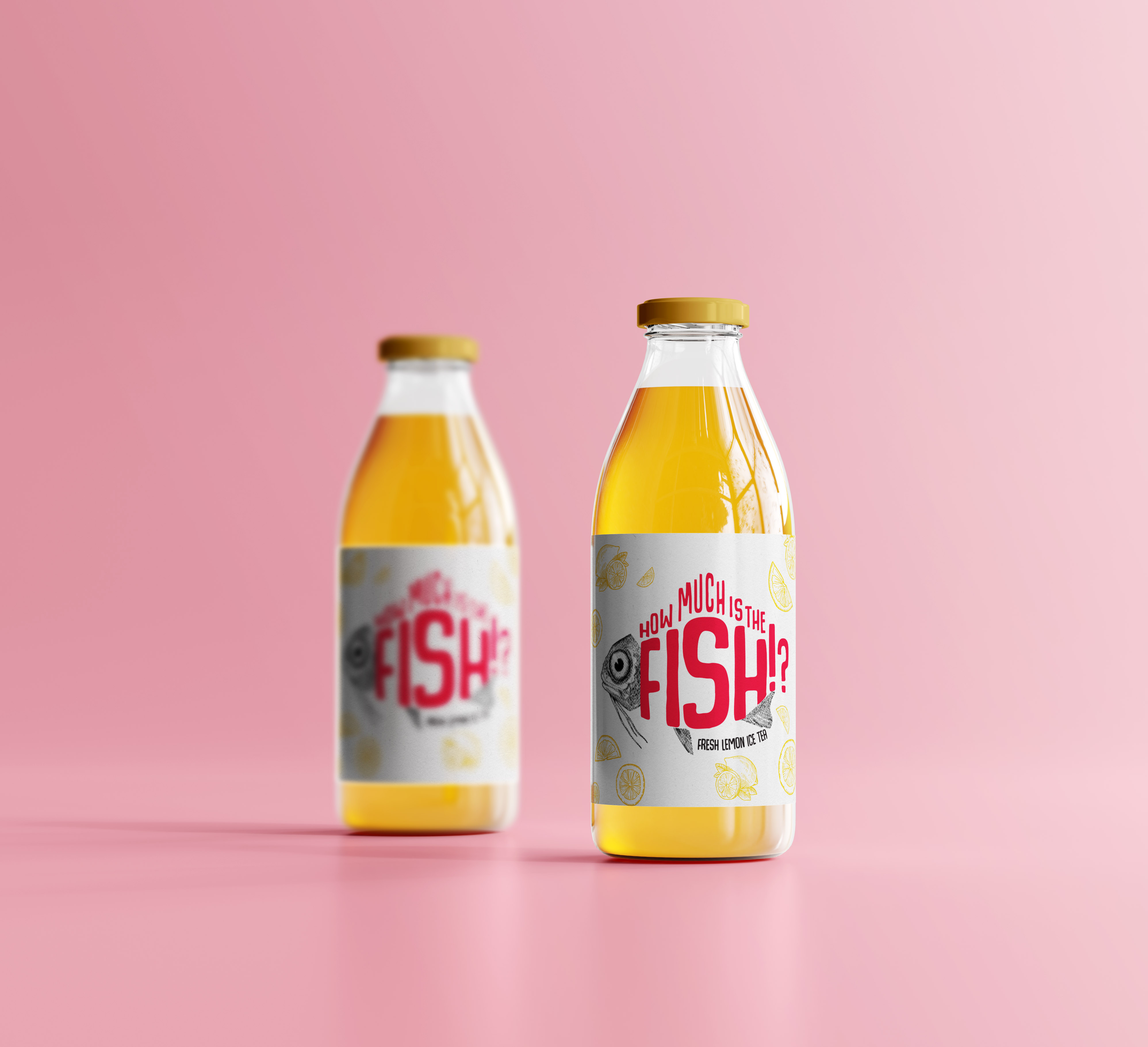
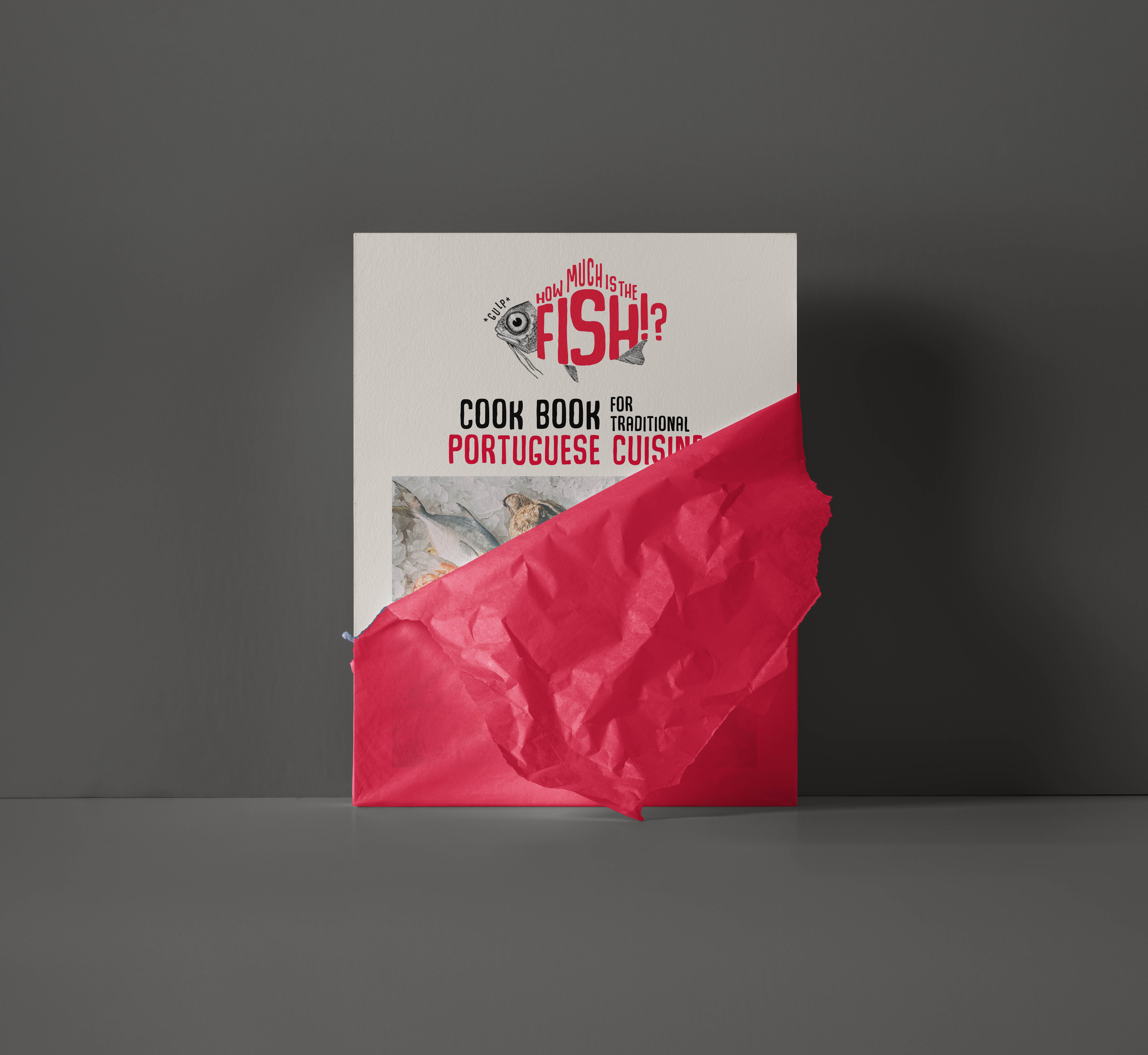
The branding is expandable for different products. For the homemade iced tea, I added fruit graphics for the lable and left away the *gulp* since it doesn't "harm" the fish. In the cook book, food photography expands the design which is also incorporated with the typography.
